MOON ORAL CARE
Structural Packaging Development
Color System
Pattern / Icon Design
Printing & Embossing
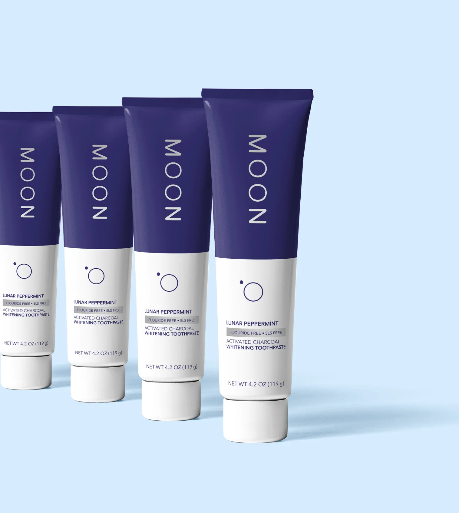
Redesign of packaging for Moon Oral Care. While Moon's toothpaste packaging conveys their message and brand image very well, I wanted to create a dieline and design that symbolized the moon and told a story.
I created a custom slide-out dieline that reveals the moon phases as the inner box is removed. I drew a custom orbit pattern that is embossed across the entire package to symbolize a starry night. The tube counteracts the outer box with its opposite two-tone colors. The design for the tube is simple and clean, with a small silver foil finish.


Package slides open to reveal the phases of the moon